In July 2022, I had my first real foray into the world of UX Design. A project with DesignLab’s UX Academy program which introduced me to Design Thinking.
Within this project, I would utilize the Double Diamond model of problem solving consisting of: discover, define, develop, and deliver.
This project required me to design a product, starting at initial user research, ideating a product, exploring user interactions, and ending with high fidelity prototype testing.

Starting with the broad topic of learning a new skill, I developed a research plan that focused on looking into helping the people within the Super Smash Brothers Melee Community.
With a research goal of finding out how people within this world find tournaments, so that we can develop better methods to provide people with more information about the events around them.
User interviews were conducted with ten people at various levels of involvement within the Melee community, asking:

From these interviews an affinity map was created to figure out what was important for people at these events, and analyze the common elements that showed up across the interviews.
The users groups were different in age and priorities, but the commonalities were clear.
All of this research led to the identification and development of three main user groups and the three personas that epitomize the primary characteristics, goals, motivations, and needs of each group.


Now that I knew the users,
I knew how I could help them.
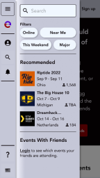
Users needed three things primarily, a platform for locating upcoming events, an effective method for searching and filtering through these events, and they needed a way to find out the much sought out information of viewing which events that their extended friend networks were interested in.
A hybrid card sorting study was sent out with 25 responses via OptimalWorkshop. A feature set was developed and placed alongside sitemap items during this study and the study showed that the users categorized these items into five main categories, giving me a solid glimpse into the mental models that users would have when it comes to navigating through these features. These categories then became the basis of the site structure.

A sitemap was created from the data gathered in the card sorting study. Features that were necessary for a minimum viable product were decided, and these features informed the creation of user and task flows.

Three user flows were chosen to address the three critical goals for the users when using the product.

The product itself was ready to start coming together. Task flows were developed from the previous information, and these were used as the basis for the mid fidelity wireframing.
Being designed with a mobile first mentality, the wireframes were made on a 360px base and laid out to ensure that all the necessary information had a space on the screen.
Built with a 12 column grid for flexibility, the design was then translated into desktop resolution, the larger space allowed more information to be freely displayed.


Branding was developed, and a style tile was created for the product as resynced.gg continued to take shape.
The brand guidelines and style tile were applied to the designs, alongside iterations on the product based on critiques from my mentor and my peers.
High fidelity prototypes were made for usability testing from the users that this product is being designed for.
The usability testing was conducted via Maze, and the results showed that 100% of 26 users tested were able to navigate through the product to achieve their intended goals.
Giving the users multiple routes to carry out the intended goals ensures that nobody gets lost.


The survey conducted alongside the usability test gave the users a chance for direct feedback. These suggestions were taken into account for the final round of iterations for the product:
Users rated the ease of navigating the site at an average of 4.6 out of 5.0. Users did comment, that while the site was easy to navigate, there were certain aspects where the prototype behaved counter to their expectations.


Overall, my first experience going in depth into UX research and design went well. I wasn’t expecting to enjoy the initial user research to the extent that I did. I learned a lot about the process and how each part would inform the next, starting from discovering a problem, defining what was to be addressed, developing a proposed solution, and delivering an acceptable prototype, all the while iterating based on user, mentor, and peer critiques. Looking back, I could have tested trickier user/task flows, but the project was for the minimum viable product, and in that sense, it works.
My next project would take what I learned, and do it all again, but with an actual product for an actual client.

